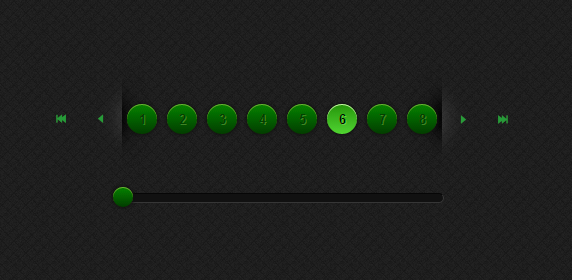
Сначала заливаем всё из архива в файловый менеджер.
Код
.paginator_p {
text-align:center;
float:left;
height:20px;
cursor:pointer;
color:white;
background-color:#B7B7B7;
list-style-type:none;
}
.paginator_p.over {
background-color:#8B8B8B;
}
.paginator_p.selected {
background-color:#CAFF3A;
color:white;
background-color:black;
}
.paginator_p_wrap {
position:relative;
overflow:hidden;
float:left;
-webkit-user-select: none;
-khtml-user-select: none;
-moz-user-select: none;
-o-user-select: none;
user-select: none;
}
.paginator_p_bloc {
position:relative;
width:3000px;
}
.paginator_slider {
float:left;
clear: left;
height: 4px;
top: 4px;
background: white;
border: solid 1px black;
position:relative;
}
.paginator_slider .ui-slider-handle {
width: 8px;
height: 12px;
position: absolute;
top: -4px;
background-color:black;
}
.jPaginatorOver {
background-color: #BCF2D5;
float: left;
height: 20px;
margin: 0 2px;
text-align: center;
width: 30px;
}
.jPaginatorMax {
background-color: #5FAABC;
cursor: pointer;
float: left;
height: 20px;
text-align: center;
width: 30px;
}
.paginator_p {
height: 30px;
width: 30px;
line-height: 30px;
text-align: center;
font-size: 13px;
font-weight: bold;
color: #26430c;
/*1px right and down offset, no blur and offwhite*/
text-shadow: 1px 1px 0px #5a8332;
/* FF3.5+, Opera 9+, Saf1+, Chrome */
background-color: #4A821B;
background-image: url('/images/sprite.png') no-repeat 0 0;
/*image fallback for none supporting browsers*/
background-image: -webkit-gradient(linear, left top, left bottom, from(#4a821b), to(#243f0d));
/* Saf4+, Chrome */
background-image: -webkit-linear-gradient(top, #4a821b, #243f0d);
/* Chrome 10+, Saf5.1+ */
background-image: -moz-linear-gradient(top, #4a821b, #243f0d);
/* FF3.6 */
background-image: -ms-linear-gradient(top, #4a821b, #243f0d);
/* IE10 */
background-image: -o-linear-gradient(top, #4a821b, #243f0d);
/* Opera 11.10+ */
background-image: linear-gradient(top, #4a821b, #243f0d);
/*border radius half the width and height of our links to create a circle*/
-moz-border-radius: 15px;
/* FF1-3.6 */
-webkit-border-radius: 15px;
/* Saf3-4, iOS 1-3.2, Android <1.6 */
border-radius: 15px;
/* Opera 10.5, IE9, Saf5, Chrome, FF4, iOS 4, Android 2.1+ */
/*box shadow - no offset, but a blur of 4px and spread of 1px*/
/*plus an additional box-shadow to create the glow*/
-moz-box-shadow: 0 0 4px 1px #191919, inset 0 1px 0 #7ead42;
/* FF3.5+ */
-webkit-box-shadow: 0 0 4px 1px #191919, inset 0 1px 0 #7ead42;
/* Saf3.0+, Chrome */
box-shadow: 0 0 4px 1px #191919, inset 0 1px 0 #7ead42;
/* Opera 10.5, IE9, Chrome 10+ */
}
/*state for selected, plus hover whilst selected. This can come before or after the general hover state due to outranking specificity*/
.paginator_p.selected, .paginator_p.selected:hover {
color: #0d1804;
/*1px right and down offset, no blur and pale green*/
text-shadow: 1px 1px 0px #8dc953;
/* FF3.5+, Opera 9+, Saf1+, Chrome */
background-color: #589225;
background-image: url('/images/sprite.png') no-repeat -80px 0;
/*image fallback for none supporting browsers*/
background-image: -webkit-gradient(linear, left top, left bottom, from(#589225), to(#87D445));
/* Saf4+, Chrome */
background-image: -webkit-linear-gradient(top, #589225, #87D445);
/* Chrome 10+, Saf5.1+ */
background-image: -moz-linear-gradient(top, #589225, #87D445);
/* FF3.6 */
background-image: -ms-linear-gradient(top, #589225, #87D445);
/* IE10 */
background-image: -o-linear-gradient(top, #589225, #87D445);
/* Opera 11.10+ */
background-image: linear-gradient(top, #589225, #87D445);
/*box shadow - no offset, but a blur of 2px and spread of 1px*/
/*plus an additional box-shadow to create the glow - slightly brighter than normal state*/
-moz-box-shadow: 0 0 2px 1px #191919, inset 0 1px 0 #cff3a2;
/* FF3.5+ */
-webkit-box-shadow: 0 0 2px 1px #191919, inset 0 1px 0 #cff3a2;
/* Saf3.0+, Chrome */
box-shadow: 0 0 2px 1px #191919, inset 0 1px 0 #cff3a2;
/* Opera 10.5, IE9, Chrome 10+ */
}
.paginator_p:hover {
color: #0d1804;
/*1px right and down offset, no blur and pale green*/
text-shadow: 1px 1px 0px #8dc953;
background-color: #87D445;
background-image: url('/images/sprite.png') no-repeat -120px 0;
/*image fallback for none supporting browsers*/
background-image: -webkit-gradient(linear, left top, left bottom, from(#87d445), to(#589225));
/* Saf4+, Chrome */
background-image: -webkit-linear-gradient(top, #87d445, #589225);
/* Chrome 10+, Saf5.1+ */
background-image: -moz-linear-gradient(top, #87d445, #589225);
/* FF3.6 */
background-image: -ms-linear-gradient(top, #87d445, #589225);
/* IE10 */
background-image: -o-linear-gradient(top, #87d445, #589225);
/* Opera 11.10+ */
background-image: linear-gradient(top, #87d445, #589225);
/*box shadow - no offset, but a blur of 2px and spread of 1px*/
/*plus an additional box-shadow to create the glow - slightly brighter than normal state*/
-moz-box-shadow: 0 0 4px 1px #191919, inset 0 1px 0 #cff3a2;
/* FF3.5+ */
-webkit-box-shadow: 0 0 4px 1px #191919, inset 0 1px 0 #cff3a2;
/* Saf3.0+, Chrome */
box-shadow: 0 0 4px 1px #191919, inset 0 1px 0 #cff3a2;
/* Opera 10.5, IE9, Chrome 10+ */
}
/*the slider rail*/
.paginator_slider {
/*margin on the left pushes it past the nav buttons,
so make the distance the total width, including margins of the nav buttons*/
margin: 20px 0 20px 80px;
/*with height of 8px, plus border of 1px all round our hight totals 10px*/
height: 8px;
background: #181818;
border: 1px solid #393939;
border-top-color: #0f0f0f;
border-left-color: #0f0f0f;
/*border radius for ff, safari + chrome, css3*/
/*half the total height of our element to create rounded ends*/
-moz-border-radius: 5px;
/* FF1-3.6 */
-webkit-border-radius: 5px;
/* Saf3-4, iOS 1-3.2, Android <1.6 */
border-radius: 5px;
/* Opera 10.5, IE9, Saf5, Chrome, FF4, iOS 4, Android 2.1+ */
}
/*the slider, er, knob?*/
.paginator_slider .ui-slider-handle {
height: 20px;
width: 20px;
margin-left: -10px;
/*nudges the knob left, half its width*/
/*remove outline in ff*/
outline: none;
/*border radius for ff, safari + chrome, css3*/
/*half the width and height of knob to create a circle*/
-moz-border-radius: 10px;
/* FF1-3.6 */
-webkit-border-radius: 10px;
/* Saf3-4, iOS 1-3.2, Android <1.6 */
border-radius: 10px;
/* Opera 10.5, IE9, Saf5, Chrome, FF4, iOS 4, Android 2.1+ */
/*alter the positioning to bring it centred to rail*/
top: -7px;
/*same styling as links*/
background-color: #4A821B;
background-image: url('/images/sprite.png') no-repeat 0 0;
/*image fallback for none supporting browsers*/
background-image: -webkit-gradient(linear, left top, left bottom, from(#4a821b), to(#243f0d));
/* Saf4+, Chrome */
background-image: -webkit-linear-gradient(top, #4a821b, #243f0d);
/* Chrome 10+, Saf5.1+ */
background-image: -moz-linear-gradient(top, #4a821b, #243f0d);
/* FF3.6 */
background-image: -ms-linear-gradient(top, #4a821b, #243f0d);
/* IE10 */
background-image: -o-linear-gradient(top, #4a821b, #243f0d);
/* Opera 11.10+ */
background-image: linear-gradient(top, #4a821b, #243f0d);
/*box shadow - no offset, but a blur of 4px and spread of 1px*/
/*plus an additional box-shadow to create the glow*/
-moz-box-shadow: 0 0 4px 1px #191919, inset 0 1px 0 #7ead42;
/* FF3.5+ */
-webkit-box-shadow: 0 0 4px 1px #191919, inset 0 1px 0 #7ead42;
/* Saf3.0+, Chrome */
box-shadow: 0 0 4px 1px #191919, inset 0 1px 0 #7ead42;
/* Opera 10.5, IE9, Chrome 10+ */
}
/*container for buttons - add some padding so we can see the drop shadow*/
.paginator_p_bloc {
padding: 5px 0;
}
.paginator_p_wrap {
margin: 0;
padding: 35px 0;
/*multiple background images, one for the left, one for the right*/
background: url('/images/sprite.png') left -250px no-repeat, url('/images/sprite.png') right -250px no-repeat
}
/*let's deal with the control buttons*/
/*general styles for controls*/
.control {
float: left;
width: 40px;
height: 40px;
margin: 35px 0 0 0;
position: relative;
cursor: pointer;
}
#max_backward {
background: url('/images/sprite.png') no-repeat 0 -60px;
}
#over_backward {
background: url('/images/sprite.png') no-repeat -40px -60px;
}
#over_forward {
background: url('/images/sprite.png') no-repeat -80px -60px;
}
#max_forward {
background: url('/images/sprite.png') no-repeat -120px -60px;
}
/*hovers*/
#max_backward:hover {
background: url('/images/sprite.png') no-repeat 0 -100px;
}
#over_backward:hover {
background: url('/images/sprite.png') no-repeat -40px -100px;
}
#over_forward:hover {
background: url('/images/sprite.png') no-repeat -80px -100px;
}
#max_forward:hover {
background: url('/images/sprite.png') no-repeat -120px -100px;
}
/*highlights*/
#over_backward:after {
content:'';
background: url('/images/sprite.png') -40px -140px no-repeat;
display: block;
height: 110px;
width: 30px;
/*position the highlight owing to awkward inherited floats and margins from .control*/
position: absolute;
right: 0px;
top: -35px;
}
#over_forward:after {
content:'';
background: url('/images/sprite.png') -80px -140px no-repeat;
display: block;
height: 110px;
width: 30px;
/*position the highlight owing to awkward inherited floats and margins from .control*/
position: absolute;
left: 0px;
top: -35px;
}


 0
0

 Времени было мало, поэтому я скачал полностью все, что было и сделал архив


